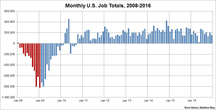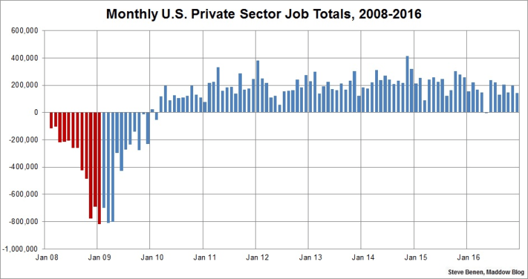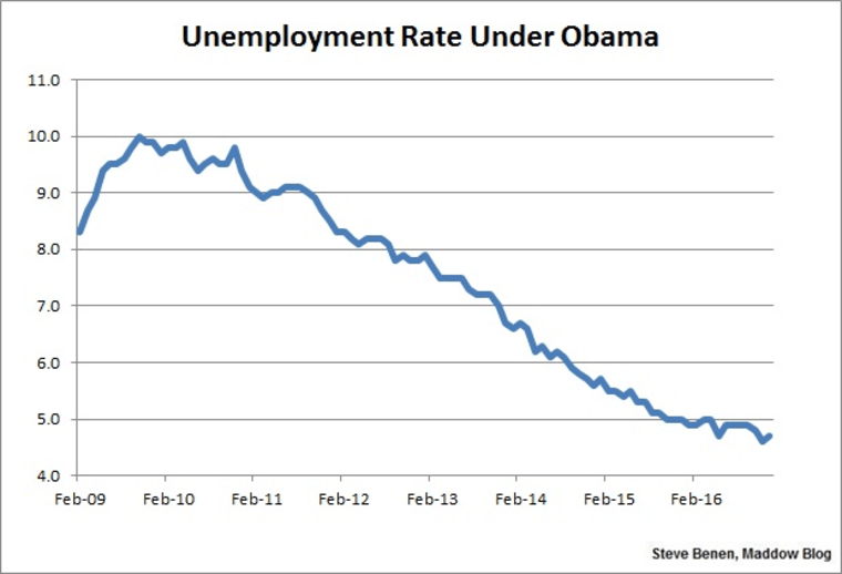
President Obama won't leave office for another two weeks, but this morning brought the final jobs report of his second term. It offered the latest in a series of reminders that the president is handing off a healthy economy to his successor (who spent 2016 telling voters the economy is terrible).The Bureau of Labor Statistics reported this morning that the U.S. economy added 156,000 jobs in December. The unemployment rate, meanwhile, remains low, inching higher from 4.6% to 4.7%. It's the 15th consecutive month the rate has been at 5% or lower. (Remember when Mitt Romney said he might be able to get the jobless rate down to 6% by the end of his first term? I do.)As for the revisions, October's and November's job totals were both revised up, adding a net gain of 19,000.Also of interest, this report showed a larger-than-expected hike in average hourly earnings, suggesting not only that job growth is steady, but American wages are improving, too.Though the latest data still faces some revisions, the preliminary estimates now show the overall economy added 2.15 million new jobs in 2016, which is a pretty healthy number. What's more, December was the 75th consecutive month of positive job growth, which is the longest on record.Remember, as we discussed last month, as far as Republicans are concerned, results like these were completely impossible. For the right, the combination of the Affordable Care Act, higher taxes, and assorted regulations would stifle job growth and push the economy into a recession, but the exact opposite happened. Nevertheless, Donald Trump and GOP lawmakers believe they'll "get the economy moving" by undoing the policies that brought us to this point.We'll see how that works out.Above you'll find the chart I run every month, showing monthly job losses since the start of the Great Recession. The image makes a distinction -- red columns point to monthly job totals under the Bush administration, while blue columns point to job totals under the Obama administration.Update: Here’s another chart, this one showing monthly job losses/gains in just the private sector since the start of the Great Recession.

